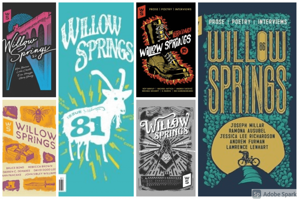
Spokane-based artist and graphic designer Chris Bovey is the mastermind behind the cover art for Willow Springs issues 81 through 86. Each of these covers is iconic Spokane, and his work has forever shaped the look and feel of Willow Springs magazine for the better.

Bovey’s goal is to cherish and capture the heart of Spokane. To glorify the beauty that makes a town feel like home. His work gravitates to the old and new iconic places and landmarks of the area and its signs. Every piece is handmade, signed, and numbered. Each one is made with care, and you can always find Chris’s limited edition prints at Atticus Coffee in Spokane.
Who are the artists and graphic designers you most admire, and how have they influenced you?
No doubt, Andy Warhol and Norman Rockwell. Andy reshaped how we view art and asked his viewers to look at advertising in a new light and see the beauty in it. Rockwell captured a vivid sense of nostalgia and created a sense of place.
Do you have a favorite piece of art (yours or someone else’s) and why?
I LOVE this Ernst Haas Route 66 photo taken in 1969 in Albuquerque New Mexico. This is the only piece of art I have hanging in my house other than mine. I have spent many, many hours looking at all the detail in the piece. It speaks to Americana and capitalism in the 50s and 60s.
Much of your art showcases Spokane’s more popular architecture, nature, and city features. How has Spokane as a city informed your sense of design? Do you hope your art influences the way Spokanites and visitors alike appreciate the city?
I started this project because so many people thought Spokane sucked. This popularized the “Spokane doesn’t suck” phase, but instead of just claiming that, I really wanted to showcase why it didn’t suck. Instead of comparing ourselves to Seattle and Portland, I wanted to show people how cool this city really is and see it in a new light. Hopefully, people see that.
How has your work with the Inlander informed your life/art?
The Inlander taught me simple is king. We had a rule there that it had to pass the “across the room test.” If folks didn’t know what it was from across the room, then you failed. I took this lesson with me and it always reminds me that simpler is better when it comes to bold artwork.
You’re really involved with the community in Spokane. What do you love most about that community work, and how do you feel like your art has impacted it or been impacted by it?
People make this city amazing. Whether working with the homeless — feeding them on street corners — or meeting people at my shows and talking to them about their memories of this place. I just love talking to other people and getting to know them and what makes them tick. They influence my work because they guide where this project goes.
What are some of your favorite galleries, publications, and venues?
I am an outsider when it comes to the art community. I don’t know if this answered your question, but I have always wanted to make art more accessible to people and bring it to them. So I love the idea of having a surprise pop-up show at a place like Dick’s where no one would expect it. More things like that take the pretentiousness out of art and make it a bit more approachable.
What other interests do you have that might inform your work?
I dig going to antique shops in Hillyard and looking for rad postcards and matchbooks to see the local advertising of the past and maybe bring it back to life. I can spend a whole day just goofing around there!
Where can people find your work? What are you working on now?
You can find it at Atticus [Coffee & Gifts] and online at vintageprint.us. I was just asked by the Balazs family to do a limited run of the famous “Transcend the Bullshit” piece! It is a huge honor!

