
Student Contributor: L. Estey
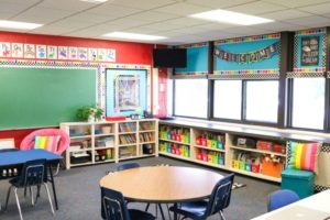 This tool uses the idea of purposeful design and coloring in your classroom to make it appeasing to the eye. When you are thoughtful about your colors and design, it helps to create a space for students where they are more likely to be better focused and more comfortable.
This tool should be well thought out, prior to the school year beginning. You can even kid your students involved in creating their own learning space, they will take more pride in it and it creates a bonding opportunity for you all. You will want to focus on making sure that your classroom colors are calm, but not dull. Yellows, blues, and salmon tend to be great for the lower grade levels. You will also want to make sure that your room doesn’t have too much clutter, is thoughtfully laid out, and that visitors can easily know what your class is currently learning about.
 This tool is in the Preventative phase, it is completely done before the first time your class ever meets. If a student feels calm, comfortable, and focused in the class room, rather than getting caught up in the chaotic mess, they are already more likely to behave better. The set-up of your room is necessary when making your rules procedures, or making sure that it has places like a spot for group projects, community circle or Australia? Designing for desks to be in groups, leads to having community supplies, which flows into the Supportive phase. This tool connects to the student directed and collaborative Theories of Influence. Although the teacher implements it, the cause is all for the students gain. In the long run it makes everything easier on the teacher, but in the beginning the end role is not for the teacher’s betterment, making this student directed. It is also collaborative because the teacher is the one implement the design of the classroom and using the space too.
More Information –
Tool Source: Kovalik, S., & Olsen, K. (2005) Exceeding expectations: A user's guide to implementing brain research in the classroom (3rd ed.). Federal Way, WA: Books for Educators, Inc.


I implemented this tool in a third-grade class with about 25 students. The tool was easy to prepare because when I knew the content that I was going to teach I designed everything around that. When designing I made sure to include lots of visuals to support the text and talk about the content. In other parts of the learning, I color-coded according to colors that are calming to students their age, so I used a salmon color most times. The tool was easy to implement as well because it didn’t stop or disrupt the learning. I noticed that when I purposefully designed and colored what I was teaching students were more engaged with the learning. Even students who were usually quiet and hardly engaged in the learning were participating. I do not believe that this tool needs to be adjusted because from what I observed it was very successful as is.