TABLEAU
RESOURCES + TRAINING
Did you know all EWU employees have free access to Tableau?
Tableau is required to view many different data dashboards at EWU. If you haven’t already, just fill out and submit the request form.
| Request Tableau Access | Tableau Resources Webpage | Tableau Canvas Course |
How to Solve Common Tableau Problems:
Tableau recognizes the permission level of each individual user. This limits the most commom problems to one of the following:
- Not being able to log in to Tableau:
- You probably still need to request Tableau access.
- Not being able to view any data using Tableau:
- You probably still need to request database access.
- Not being able to run a dashboard or data report:
- The data behind the dashboard probably requires a higher permission level than what has been granted to you.
- If you believe your permission level should allow you to view any data that you can’t, please check with your supervisor, re-submit the database access requesr form, or both.
The Three Ways Dashboards Are Displayed:
- As a single dashboard:
- An individual dashboard typically does not have any navigation functions (no tabs or cards).
- Our Annual Retention series is a single dashboard.
- A Set of Dashboards:
- A set of dashboards will be displayed in tabs rather than cards. Any filters chosen on one tab will be applied to all tabs.
- For example, Our Peer Institutions dashboard has seven tabs with each essentially being another dashboard.
- As a Story:
- The cards across the top of the dashboard help navigate you through the narrative of the data visualization. Filters will not carry over across cards.
- The First Time in College (FTIC) Retention and Graduation Rates dashboard is a Tableau Story. Each card uses different, but relevant data providing greater insight and context.
How to Run Data Reports Using Tableau:
You will find a wide variety of Tableau dashboards at EWU:
- Some provide insight into issues that support EWU’s overall mission and vision – where all EWU employees can make an impact.
- Other dashboards, such as those used for specific operational purposes, only a few employees have a need-to-know the information. So you may or may not be able to access a dashboard based on the content and your permission level to view its data.
- If you have access, dashboards with any higher-level data will prompt you to log in using your EWU Oracle credentials. If you do not have access, you will not see an Oracle credentials prompt.
- More information is available from the EWU IT Help Desk website.
Additional Tableau Data Reporting Resources:
| Link #1 | Link #2 | Link #3 |
| Link #4 | Link #5 | Link #6 |
Interacting With Dashboards
- Using Filters:
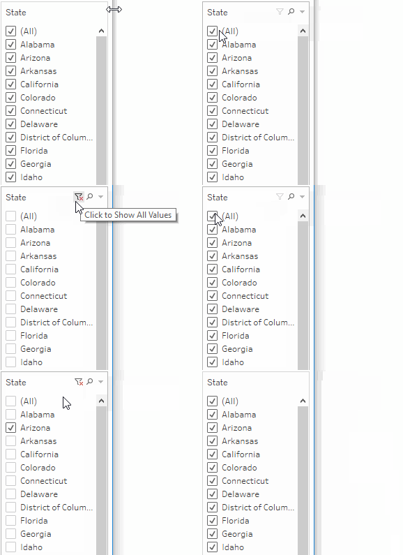
- Most dashboards have filters to refine the data results by including or excluding data. For example, selecting an individual academic year includes those data only while excluding all data for other academic years.
- After a filter is selected, the dashboard updates reflecting the new specifications.
- Filters also allow different users to retrieve different data from the same dashboard. For example, the Graduation Rates dashboard has nine filters.
- Tooltips:
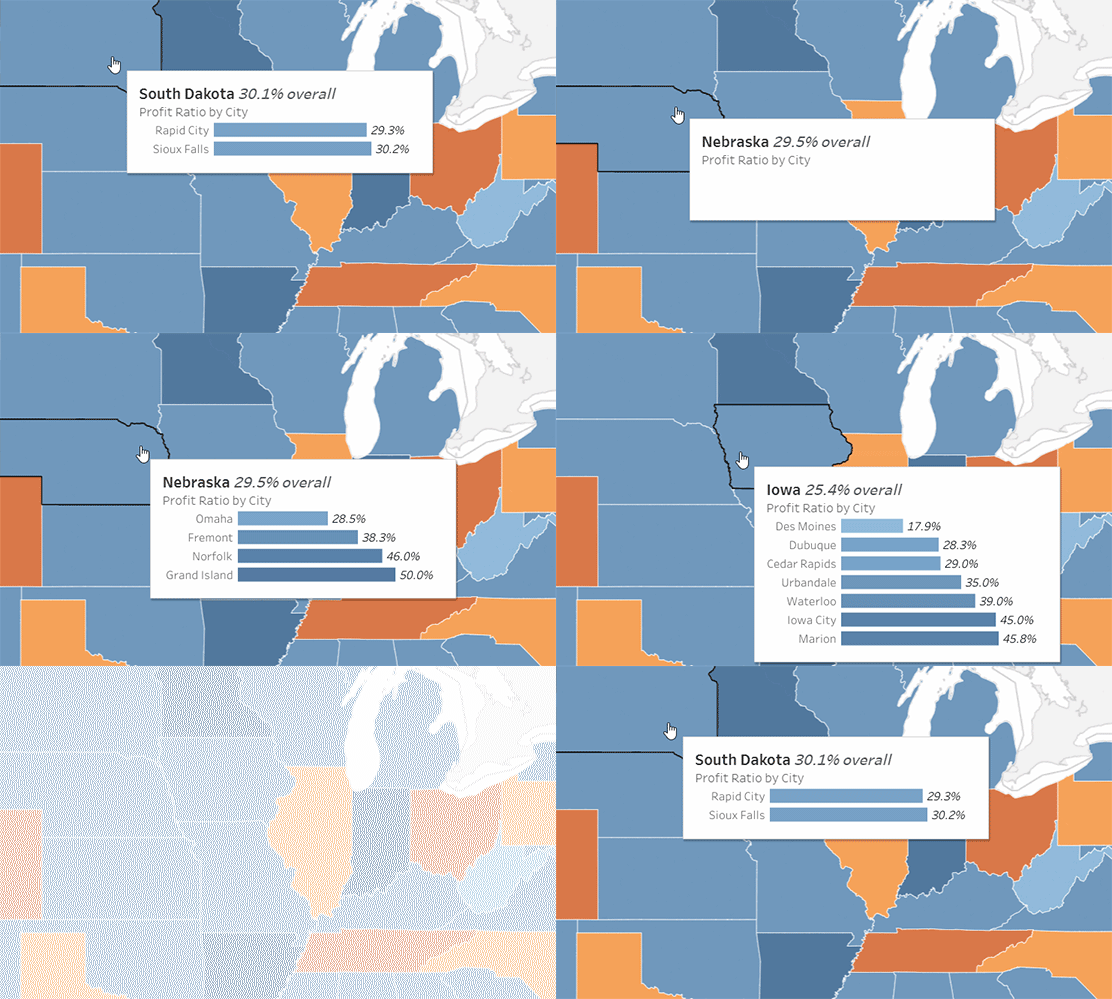
- Tooltips show additional informaton for a specific data point. Hover over a data point to reveal its tooltip.
- Highlighting:
- Clicking on a data point in a chart or legend highlights all the elements associated with the data point. To remove highlighting, click on the same element again.
- Using the Annual Fall Enrollment dashboard, click on a different element or multiple elements to watch the dashboard refine the results.
- When this dashboard initially loads, it represents all EWU students. Click on the red bar in the Student Level section and all of the other elements now show data for just undergraduate students.
Tableau Essentials – By the Topic
Courtesy of Robert Curtis May and Interworks.com
Chart Types:
Formatting Tips:
| Intro | Shapes | Labels | Color | Tootips | Maps |
Calculated Fields & Functions:
| Intro | Logical | Number | Date |
| String | Conversion | Aggregate | User |
Public Tableau Resources
Courtesy of Public Tableau. Videos include:
- Get Started (0:22)
- Navigate the Workspace Area (2:17) – Learn the layout of the workspace area and the high-level dashboard creation process.
- Area Charts: Sales by Category and Sales by Segment (5:05) – Learn several fundamental Tableau concepts while creating two area charts.
- Bar Charts: Profit Ratio by City (2:06) – Learn how to create a bar chart that appears when you hover over the map.
- Map: Profit Ratio by Geography (2:22) – Learn how to create and format a map.
- Text Tables: Key Performance Indicators (2:23) – Learn how to quickly create a text table using the measure names and measure values automatically-generated fields.
- Build a Dashboard (3:39) – Learn how to combine views and apply actions to create a fully interactive dashboard.
Community Resources available for free – no account required:
- Community Projects; Tableau Public Blog; Tableau Community Forums;
- Coursera & Trailhead Courses;
- Podcasts;
- Social Media and More
How to Use a Tableau Dashboard – The Basics:
Courtesy of DWU Consulting
Tableau “Quick Start” Guide:
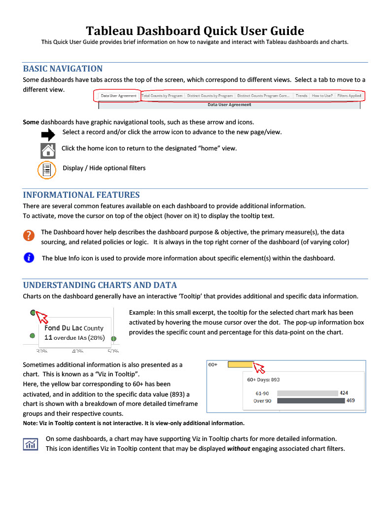
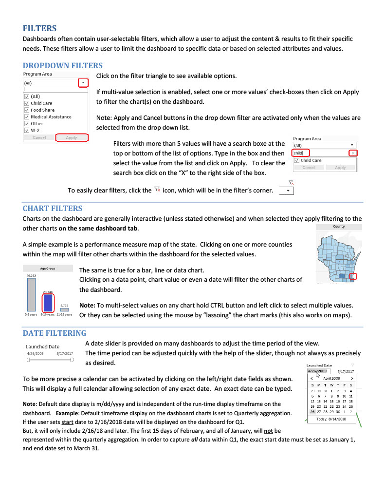
Getting Started with Tableau
Courtesy of Analytics Box
How to Use a Tableau Dashboard as a Viewer
Courtesy of Tableau Tim
The following links will jump to bookmarks within the video on YouTube:
Free Online Tableau Training Courses:
- Data Visualization and Communication with Tableau (Duke U. via Coursera)
- Tableau Tutorial For Beginners (Udemy)
- Tableau Fundamentals for Aspiring Data Scientists (Udemy)
- Introduction to Tableau (Data Camp)
- Data Visualization with Tableau Specialization (UC Davis via Coursera)
- Your Guide to Become a Tableau Expert (Analytics Vidhya)
- Learn Tableau in Three Days (Guru 99)
- Learn Tableau Data Visualization (Intellipaat)
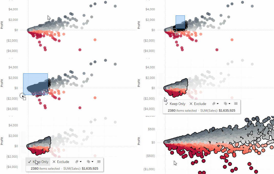
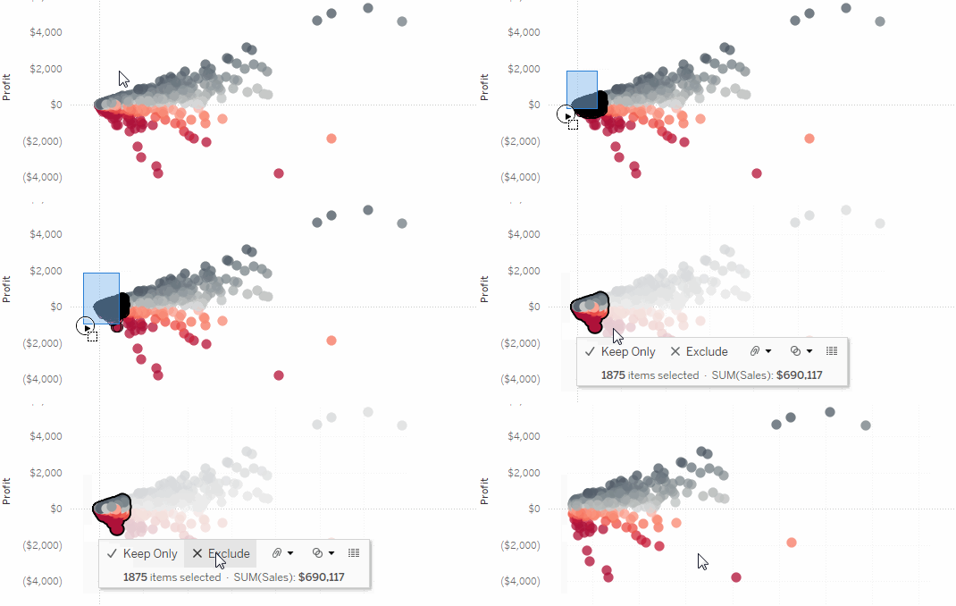
Keep or Exclude Data Points in a View:
Select Keep Only to keep only the selected marks in the view.
Select Exclude to remove the selected marks from the view.
Build Common Chart Types in Data Views:
Visual Vocabulary:
Courtesy of Tableau Visionary and Public Tableau
History of the Dow30:
Courtesy of Core Product Marketing and Public Tableau
Dashboard Basics – Using Highlighting to Filter:
Courtesy of Sesha Sai and Public Tableau
Are Big Earthquakes on the Rise? An Earthquake Trend Story:
An Earthquake Trend Story:
Sorting Data:
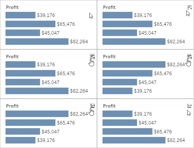
If you’re looking at a table of data and want to sort it alphabetically or numerically, just hover over a column header and click the sort icon.
Details About Specific Data Points:
As you move the mouse across a view, you’ll often see tooltips that reveal details about each data point, or mark. Marks can take many forms; here’s how they look in maps, bar charts, and tables:
View Underlying Data:
Summarized source data can provide better understanding of the data behind the dashboard. When available, first click on any mark in the view, and then the View Data icon.
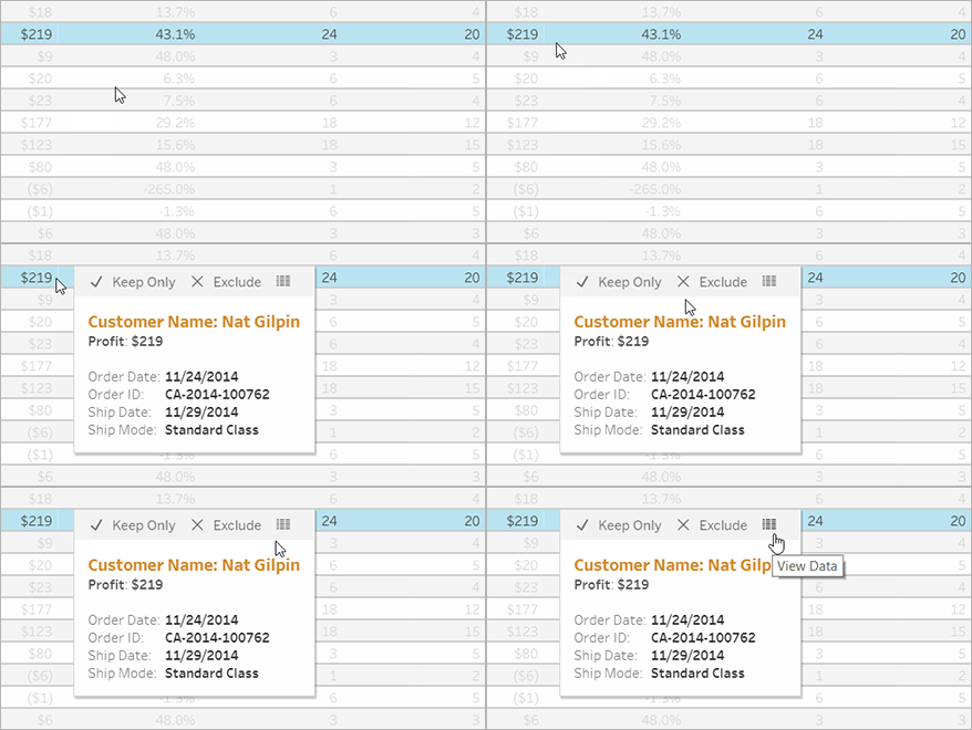
Tableau Desktop vs. Tableau Server:
What’s the Difference?
Tableau Desktop is an application that is installed locally on your machine. The application is used to create content such as reports and dashboards that can be published to the Tableau Server. You will need a license to use Tableau Desktop.
Tableau Server is a web-based modern analytics platform that contains published content (reports, dashboards) accessible 24/7 using your SSO (Single Sign-On) credentials. Tableau Server allows:
- Organizational deployment of vetted content that can be shared across an entire organization. It also allows an organization to explore/see data, to ask questions and to spot data trends.
- Interactions with the published content at no cost to the department.
- Content privacy based on each users individual data permission levels.
Tableau Canvas Course:
We have created a Tableau Resources site on Canvas where you will find documentation on:
- Tableau Server – Connect and Navigate
- How to run reports on EWU Tableau Server
- Tableau Tips and Tricks
- How to connect to ODS (Operation Data Store) in Tableau Desktop
| Register for the Tableau Canvas Course |
The Three Different Tableau Reporting Tools:
Tableau provides three levels of user tools. Each contains different features intended for varying user needs ranging from query developer to data consumer. They are:
- Creator: the data visualization and ad hoc query tool.
- Explorer: access existing workbooks on the Tableau Server to query and sort from a selection of predetermined datasets.
- Viewer: primarily for consuming information; it does not have any development or modification tools, but can select from dropdown menus of existing datasets.

