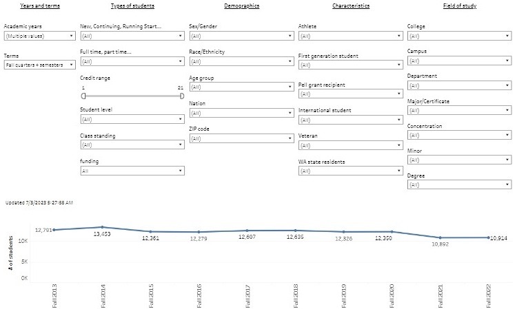
When you make a selection to one of the filters, not only will the line graph update to reflect the refined data results, occasionally the filter will change the options available under other filters.
For example, under Types of Students, change the dropdown menu for New, Continuing, Running Start… from All to Returning Grad Students and watch the dropdown menu options under Field of Study change to reflect new filter options for just graduate programs.
Make sure to click on Apply so the filter activates.
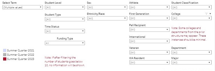
This dashboard offers daily enrollment for the current academic term and benchmarks them to the same previous two same terms. In other words, if the current term is Summer Quarter 2023, available benchmark terms will be Summer Quarters 2022 and 2021.
Filters include a variety of student academic and demographic characteristics, as well as by major, department, and college.
The timeframe measured begins more than 100-days before the start of the term and continues to 14-days past the term start date.
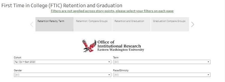
First Time in College (FTIC) Student Retention and Graduation Rates
Three Things About This Dashboard:
Hovering over any data point in the line graph will show a popup with information that is both relevant to the specific data point (a number and a share). In the first card for this On this dashboard, each data point along the line graph for offers a number and a share.
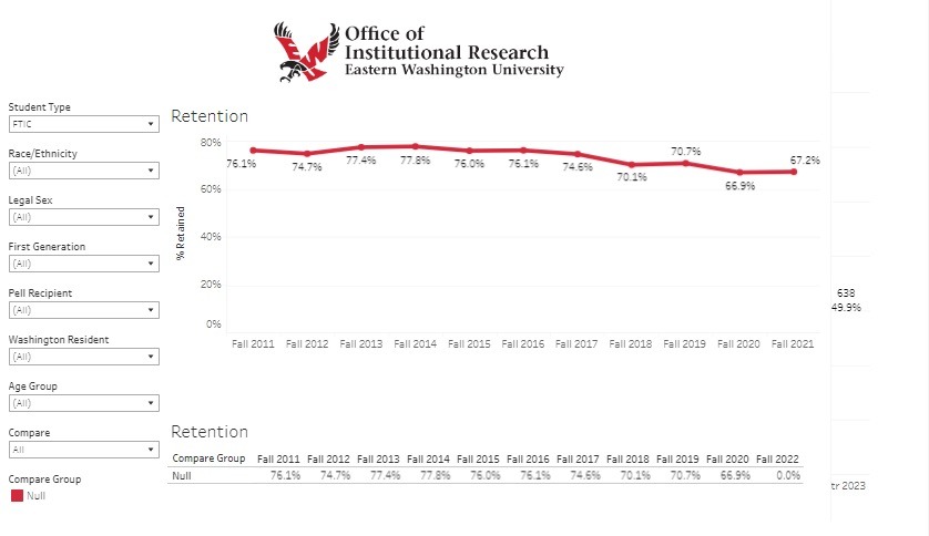
On all four cards, student cohorts are the primary filter option. The student enrollment total for the cohort year selected will be the first data point in the graph. Subsequent data points show the number of students still enrolled at the beginning of each new term and the retention rate based on the original cohort enrollment totals.
The first and third story card dashboards generally refer to cohorts of students who started during the same academic term, while the second and fourth story card dashboards allow a more direct comparison of different student groups that are a part of the original cohort.
Did you notice this dashboard doesn’t have any tabs or story cards? Multiple dashboards aren’t always necessary.
This dashboard uses both a line graph and a descriptive data table to display data resulting after filters are set.
Three student types are offered in the first dropdown menu filter: First-Time in College (FTIC) students, students who transferred to EWU after starting college at a different institution, and the combination of both.
On this dashboard, there are two tabs. The second tab, README, provides additional information too large for what is typically provided in little popups when hovering over a data point.
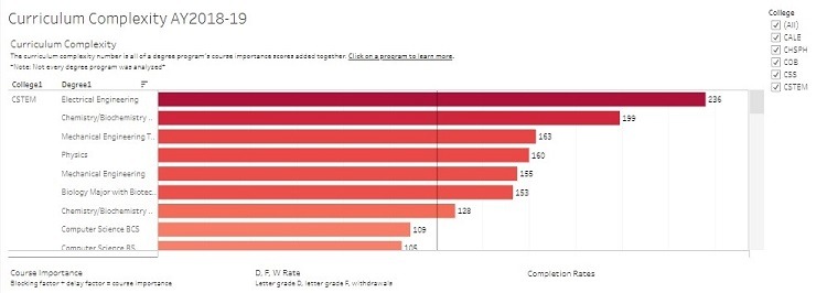
This dashboard measures the course importance scores for programs. Hovering over College1 and Degree1 provide additional options to view the data results, such as sorting alphabetically. Click on the “Curriculum Complexity” button at the top of this webpage for more detailed information.
Next, click on one of the bars in the graph and additional data (course importance scores, share of students earning a D, F, or withdrew, and completion rates) will populate in a second chart below the main.
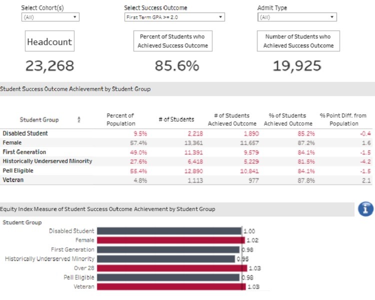
This dashboard has two tabs: By Outcome and By Group. Selecting or changing filters on one tab will get applied to the other. The three main filters are: fall cohort, success outcome (by GPA, number and type of credits earned or attempted, and persistence) and admit type (FTIC, Transfer, or both).
Descriptive statistics show the number of students in the cohort, the number and share achieving the selected success outcome. A breakdown is offered for each of the following student groups: disabled, female, first generation, historically underserved minority, Pell grant eligible, and veterans.
An Equity Index score is offered for each group. The formula is (percent of group achieving outcome ) / (percent of entire population achieving outcome). The By Group tab offers side-by-side comparisons for the shares of students in the group and not in the group.
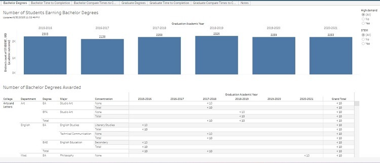
This dashboard has 7 tabs. Each provide slightly different data, but related to our students who have graduated and the degrees they earned.
Under the “Notes” tab, there is a link to a Tableau dashboard authored by the Washington State Education Research & Data Center (ERDC) titled Statewide Public Four-Year Dashboard.
You can use our graduation dashboard, the ERDC dashboard offers a broader view and comparison of higher learning institutions in Washington State.
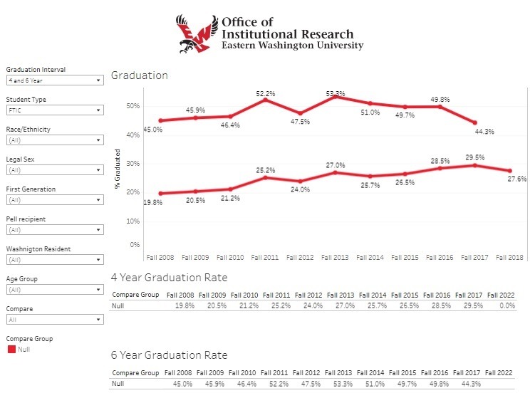
This dashboard offers two length of time measures: the shares of students who completed a bachelor’s degree within both 4-years and 6-years after starting college.
The 4-year rate is the share of all students who earned a degree within 4-years or less, while the 6-year rate is the share of all students who earned a degree within 6-years or less, which includes students captured in the 4-year rate.
The 6-year retention rate does not capture all our students who earned a bachelor’s degree because for a variety of reasons, more than a handful of students take longer than 6-years, but still earn a bachelor’s degree.
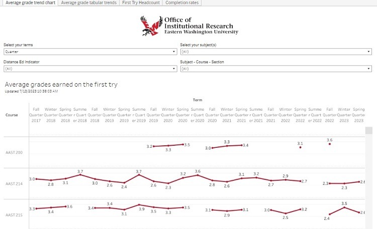
The dashboard found under the first tab uses multiple line charts for individual courses, but it’s hard to visually present these data so most or all of it can be seen at the same time.
The second tab, titled Average Grade Tabular Trends will present the same data, but using descriptive statistics in a table instead of line graphs.
The last two tabs, First Try Headcount and Completion Rates are only offered as line graphs, but there isn’t quite as much content making it easier to digest.
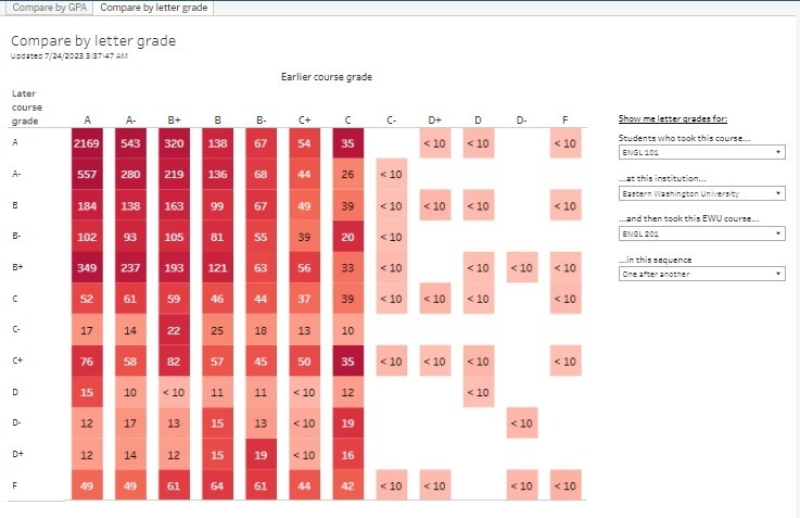
Also known as a course prerequisite checker, select a group of students who took a course… (select course) …and then took this course… (select the same or a different course) …in this sequence (one after another or at the same time).
The hover popup contains quite a bit of information so popup data are also shown as a table of descriptive statistics. These data include: the number of students who took each course, GPA in both the earlier and later course, and standard deviations for each.
Both tabs are essentially the same thing with the main difference being the first tab uses number grades and the second tab uses letter grades. , titled Average Grade Tabular Trends will present the same data results, but using descriptive statistics in a table instead of line graphs.